Sep 10, 2021
Amplified patterns in North America and Eurasia behind the extremes
Joseph D’Aleo, CCM
We told you our team was providing input on climate and energy issues to OMB to try and give them pause to take aggressive harmful to everyone policies that have failed worldwide. They included:
Amended CGECC Comment
Petition for Reconsideration
CO2 the Gas of Life
Our Alarmist Claim Rebuttals
And chapters from Evidence Based Climate Science on Surface Temperature Issues, Solar and Ocean Cycles.
All of the efforts have been done pro-bono. We lost another contributor recently, 2 in the last year 6 since we began this work. Though a large number share our objective views, many have either been silenced or even forced out of the science they love. If you can help support our continuing efforts at this important time - see the secure donate button on the left column.
-----------
The media continues to hype extremes here in North America and in Eurasia.
The Wall Street Journal story reported:
“Another heat wave will hit parts of the drought-stricken Western U.S. this weekend. The heat could meet or exceed daily records in parts of Montana and Idaho over the weekend and into early next week, said Julie Malingowski, an emergency-response meteorologist with the National Weather Service. Temperatures are forecast to exceed 100 degrees in parts of Montana beginning Saturday, with hotter temperatures reaching Idaho on Sunday. Western states have faced several record-setting heat waves this summer, including one in June that left more than 100 people dead in the Pacific Northwest. This bout of high temperatures likely won’t last as long as previous heat waves”, said Ms. Malingowski.
“The sequence of heat waves in the region this year is unprecedented and has exacerbated drought and fire conditions”, said Daniel Swain, a climate scientist at the University of California, Los Angeles.
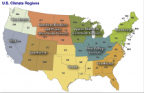
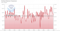
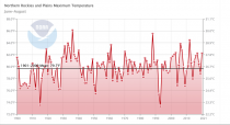
He talked about the relationship to global warming and deemed it consistent with the greenhouse models predictions of increased extremes. Actually the summer data for the Northwest and Northern Rockies and plains have not been getting hotter the last 100 years (source NOAA NCEI).

See the Northwest and Northern Rockies and Plains trends for maximum temperatures the last century.


Daniel is part of the academic/governmental/environmental climate cabal that waits for the inevitable extreme event to join with the media in hyping it as scientific proof their failing theory is validated. Surely some of the alarmists know cycles in weather and extremes of temperature and extreme weather are not man-made but are either silenced by the threat of cancellation/job loss or lured by the funding is (trillions of dollars!). There are other younger people who have been indoctrinated in this nonsense in school and believe it is true. They spend no time looking at possible other natural causes partly because they are not taught those in school.
Dr. Cliff Mass at the University of Washington has been a realist voice in that region on the Cliff Mass Weather Blog/:
“Society needs accurate information in order to make crucial environmental decisions. Unfortunately, there has been a substantial amount of miscommunication and unscientific hand-waving about the recent Northwest heatwave. This blog post uses rigorous science to set the record straight… It describes the origins of a meteorological black swan event and how the atmosphere is capable of attaining extreme, unusual conditions without any aid from our species.”
See another fact-check of the claims by Meteorologist Anthony Wattshere. He notes:
”What I find most interesting is when you examine official statewide maximum temperatures since record keeping began in about 1895, only two out of fifty have occurred in the twenty-first century. Most of the high-temperature records across the nation happened in the first half of the twentieth century. According to government records, Oregon’s record high temperature of 119F was recorded twice, both times in 1898, more than 120 years of global warming ago. Washington State’s maximum temperature of 118F was recorded first in 1928 and tied in 1961, nearly 100 and 50 years of global warming ago, respectively. Forty states’ record high temperatures were set before 1960, with 25 of the record highs being set or tied in the 1930s alone. New high-temperature records have been set in only two states since 2000, meaning more states’ record highs were recorded in the 1890s than in the first two decades of the current century.”
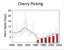
Indeed, forecasters who must predict the ups and downs and risk of extremes look at natural factors on a global scale to make their predictions ahead of each month and season. The warmists simpleton solution is always that we can expect extremes and we are responsible. They have no sense of history and when they do trend analysis, they prove that cherries are their favorite fruit. See a government report trend bars that conveniently left out the earlier more significant heat.

Enlarged
Remember the list of 50 predictions that have all failed the last half-century.
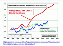
Satellite measurement of our atmosphere not contaminated by urban heat island effects shows a warming about 1/3 that of the greenhouse models.
The satellite record starts in the late 1970s and if it was available back 120 years would have shown the warming which started in 1979 was just part of a 60 year natural cycle related to ocean temperatures and solar input. Even during this period, models have overstated by a factor of three the warming.

Enlarged
See why natural factors can explain all the variability here.
So what caused the heat waves this summer in the northwest US and southwest Canada?
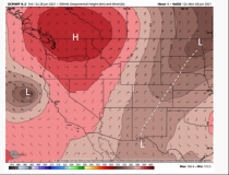
While the central and southeast has been very wet and cool for summer, the west has been very warm and in late June for several days extremely hot. It is due to an unusual location of a classic pattern of a dome of hot air we call a ‘heat ridge’ that often is the culprit on summer heat waves.
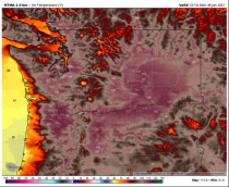
The easterly flow beneath pushed heat from the Great Basin to the west where it is forced to descend. When it descends the warm air gets warmer due to compression - and in this case to record levels - over the last 3 days of June.

Enlarged

Enlarged
When hot air descends from the mountains, it warms by compression. This occurs in the plains when heat comes east and also in the eastern cities when it descends the Appalachians. This is how 100F heat waves occur.
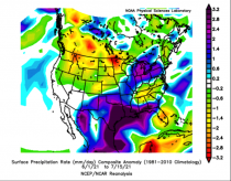
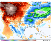
When you see heat waves they are usually surrounded by areas that are cooler and often wetter than normal. The patterns in hot summers are amplified with strong heat ridges and deeper than normal cool wet troughs. In the US it has been an unusually wet and cool for summer season in the south central and southeast.

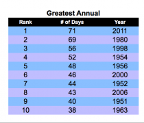
Dallas has not hit 100F yet. Summers have had as high as 71 days over 100F.
DALLAS 100F DAYS ANNUAL TOP 10

Atlanta has had only 5 90F days (the record there is 91 days).
Extreme summer heat is typically enhanced in droughty areas, which also correlates to heat ridges where the very warm temperatures aloft augmented by sinking air and the lack of available moisture keep it rain free. That has been the case in the northwest and southwest Canada since last fall. This heat waves was localized compared to the great heat waves of the past especially the1930s, when 100F readings were reported in 45 of the lower 48 states and the state all-time heat wave records for 22 states still hold.
THE INCONVENIENT COLD
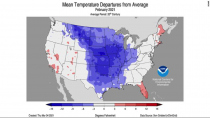
They already forgot the record cold in the plains for February 2021. At least 217 people were killed directly or indirectly by severe cold, and the damages are estimated to be at least $195.6 billion (2021 USD).
The cold snap peaked from February 14-16, NOAA reported “...approximately 30% of available US sites set cold maximum records, and about 20% set minimum records.” During that peak period, the analyzed temperatures were 40 to 50 degrees below average over much of the central and southern Plains. More than 3,000 daily record cold temperatures (minimum and maximum) were reported from February 12-17 at long-term observations (75+ years of data).
Based on preliminary data, 62 all-time daily cold minimum temperature records were broken from February 11-16 and 69 all-time daily cold maximum temperature records occurred February 15-16, said NOAA.

EURASIA MIRRORS NORTH AMERICA
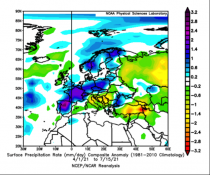
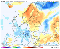
A similar see-saw was observed in Eurasia where a dipole pattern mirrored the one here in in North America. An early summer heat ridge in Eastern Europe nudged into western Russia this month where sudden high heat stressed crops. Meanwhile, the strong trough behind in this amplified pattern produced very heavy rains and disastrous and deadly flooding damage in central Europe.

See the forecast of cold and warm bands in Europe into Russia.

And the extremes west to east in the U.S.

Forecasters know ocean temperature configurations (warm and cool pools together with antecedent conditions (winter and spring dryness for example) help determine whether the pattern is amplified and persistent or more zonal and variable. They also tell us the risk of severe events like tornadoes, hurricanes, drought and floods, and heavy snows.
This year they have correctly seen the amplified pattern and extremes.
Sep 07, 2021
Net Zero Wind: Britain saved by coal - at huge cost
GWPF
Global Warming Policy Forum
Britain’s fragile electricity system is a national embarrassment and a warning to the world

London, 7 September - Yesterday, National Grid, the Electricity System Operator, was forced to paid over 20m pounds to “balance” the system and avoid blackouts, ten times more than normal.
The entire UK wind fleet was in effect completely absent for much of the day, only rising above a few percent of its theoretical output late in the day when the crisis was over.
As a result, conventional gas- and coal-fired generators had to be fired up. The UK’s creaking grid was therefore effectively being propped up by fossil fuels.
The cost of these actions was very high, with some units being paid as much as 4,000 pounds per megawatt hour to switch on, an exceptional price by any standard.
The balancing cost of avoiding blackouts has been increasing rapidly and is expected to hit 1-2 billion pounds this year, burdening consumers with ever more expensive electricity bills.
For a country claiming to be “Powering Past Coal” this is a disgrace. Worse still, in the run up to COP26 it gives the lie to any UK government claim to leadership in the delivery of Net Zero and leaves the Prime Minister no plausible platform from which to urge other countries to decarbonize.
None of this should come as a surprise. Power systems engineers and other analysts have known for decades that wind and solar power would make the UK electricity grid increasingly fragile and extremely costly. However, their warnings were ignored, and the government and the British public are now reaping the whirlwind.
Recall the experience Spain had with wind - nostalgic throwback to the days of windmills, Don Quixote the Lord of La Mancha.


Enlarged
Aug 16, 2021
Another Round Of Anti-Science From The IPCC (With A NEW Hockey Stick!)
Francis Menton
What with the ongoing catastrophe in Afghanistan and the earthquake in Haiti, among other news, you may have failed to notice that the UN IPCC came out on Monday with substantial parts of its long-awaited Sixth Assessment Report on the state of the world’s climate.
This is the first such assessment issued by the IPCC since 2014. The most important piece is the so-called Summary for Policymakers (SPM), a 41-page section that is the only part that anyone ever reads.
The IPCC attempts to cloak itself in the mantle of “science,” but its real mission is to attempt to scare the bejeezus out of everyone to get the world to cede more power to the UN.
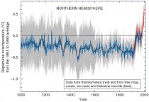
Beginning with its Third Assessment Report in 2001, the lead technician for the IPCC to generate fear has been the iconic “hockey stick” graph, supposedly showing that world temperatures have suddenly shot up dramatically in the last 100 or so years, purportedly due to human influences.
The 2001 Third Assessment Report thus prominently featured the famous Hockey Stick graph, derived from the work of Michael Mann and other authors. Here is that graph from the 2001 Report:

Enlarged
As longtime readers here know, the Hockey Stick was then demolished by the work of Canadian mathematician Stephen McIntyre through his work at his website Climate Audit.
The main issue was that the temperature “proxies” that had been used to create the “shaft” of the Hockey Stick, particularly various tree ring series, could not be shown to have any close relationship to actual temperatures; moreover, there were strong reasons from many sources to think that the Medieval Warm Period (approximately 1000 - 1300 AD) had been warmer than the present.
And then came the ClimateGate emails of 2009. From my post of February 22, 2018:
The coup de grace for the Hockey Stick graph came with the so-called Climategate emails, released in 2009. These were emails between and among many of the main promoters of the climate scare (dubbed by McIntyre the “Hockey Team"). Included in the Climategate releases were emails relating specifically to the methodology of how the graph was created. From the emails, skeptical researchers...discovered that the graph’s creators had truncated inconvenient data in order to get the desired depiction.
One particular series that had gone into the creation of the Hockey Stick had come from a guy named Keith Briffa.
Briffa’s series diverged greatly from actual temperatures, going down (declining) substantially after about 1960 when temperatures measured by thermometers had gone up.
This fact needed to be concealed in order to sustain the Hockey Stick presentation. So the creators simply deleted the inconvenient information.
The most famous of the ClimateGate emails, copied among various Hockey Stick participants (including Mann), dated November 16, 1999, discussed the situation in these terms:
I’ve just completed Mike’s Nature trick of adding in the real temps to each series for the last 20 years (i.e. from 1981 onwards) and from 1961 for Keith’s to hide the decline.
In any rational world, that email alone would have ended the careers of all of these participants.
In the actual world where we live, Mann continues to hold a prestigious position at Penn State University, and in February 2018 he won the AAAS award for “Public Engagement With Science.”
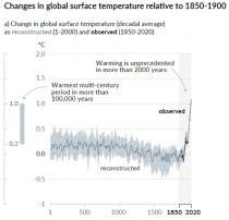
And with that background, we come to this week’s SPM. After a few preliminaries, here’s the big scary headline:
Human influence has warmed the climate at a rate that is unprecedented in at least the last 2000 years
And to prove it? Yes, it is another Hockey Stick graph. Although coming from different authors and seemingly different data, it bears a striking resemblance to the Mann et al. graph of 2001.

Enlarged
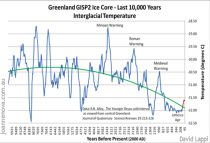
Editor Note: Tell it to the Greenland ice.

Enlarged
McIntyre is promptly on the job again. Here is his post of August 11, basically dismantling the new Hockey Stick. If you have a taste for a lot of technical detail, I urge you to read the whole thing.
But the gist is actually simple. This time these people were not going to get caught furtively “hiding the decline”. Instead, they announce boldly that they are simply going to exclude any data that does not fit the narrative that they are putting forth.
McIntyre goes through multiple of the data series that contribute to the “shaft” of the new stick. Most just appear to be random fluctuations up and down.
But then there are the few key series that shows the sharp 20th-century uptick needed to support the Hockey Stick narrative. One such series is the McKenzie Delta tree ring series from Porter, et al., of 2013.
McIntyre goes back to that , and quotes the passage that describes how the researchers chose those trees that would contribute to the series.
Got that? It’s a “divergence-free chronology.” You can get that by simply excluding any data that don’t conform to the result that you want.
And you don’t even have to exclude whole trees from the series, but only those portions from a particular tree that just don;t seem to be going along.
McIntyre comments:
They took “hide the decline” to extremes that had never been contemplated by prior practitioners of this dark art. Rather than hiding the decline in the final product, they did so for individual trees: as explained in the underlying article, they excluded the “divergent portion” of individual trees that had the temerity to have decreasing growth in recent years. Even Briffa would never have contemplated such woke radical measures.
Decide on your desired conclusion and then just exclude any data that refuses to go along. This is the “science” on which our world leaders are off spending multiple trillions of taxpayer dollars.
Read more at Manhattan Contrarian.
--------------
IN THEIR OWN WORDS
Maurice Strong , UN Executive Director in 1970s saw CO2 as a tool to Proselytize for One World Government. “...Isn[t the only hope for the planet that the industrial civilization collapse...isn’t it our job to bring that about”
“In searching for a new enemy to unite us, we came up with the idea that pollution, the threat of global warming...would fit the bill...It does not matter if this common enemy is “a real one or...one invented for the purpose.” Club of Rome advisor to the UN “First Global Revolution” 1991
“We have got to ride the global warming issue. Even if the theory of global warming is wrong, we will be doing the right thing in terms of economic policy and environmental policy.” Timothy Wirth, U.S. Senator, president of the United Nation’s Foundation;
“No matter if the science of global warming is all phony....climate change provides the greatest opportunity to bring about justice and equality in the world.” Christine Stewart, former Canadian Minister of the Environment
UN Climate Chief Christine Figueres said “Our aim is not to save the world from ecological calamity but to change the global economic system (destroy capitalism).”
UN IPCC Lead Author Ottmar Edenhofer in November 2010. “One has to free oneself from the illusion that international climate policy is environmental policy.” Instead, climate change policy is about how “we redistribute de facto the world’s wealth.”
Rep. Alexandria Ocasio-Cortez’s chief of staff recently admitted that the Green New Deal was not conceived as an effort to deal with climate change, but instead a “how-do-you-change-the-entire economy thing”—nothing more than a thinly veiled socialist takeover of the U.S. economy. “The interesting thing about the Green New Deal is it wasn’t originally a climate thing at all,” Saikat Chakrabarti said in May.
There are some clear benefits of wind and solar.

Enlarged
Jun 26, 2021
Arctic Tales and Fails
Joseph D’Aleo CCM
Reports the last few decades about the diminished arctic ice has restarted talk about the possibility it opens up the arctic for Russia a shipping passage through its northern waters that could put it at the center of a new global trade shipping route. Nothing is new for those that care enough to look and know enough about this matter.
The Northwest Passage is a sea corridor connecting the Atlantic and Pacific Oceans through Canada’s Arctic Archipelago islands and along the northern-most coast of north America. Europeans searched for 300 years to find a viable sea trade-route to Asia. Columbus, European navigators began to seek a western route. Prominent in this search were such names as Jacques Cartier, Gaspar and Miguel Corte-Real, Sir Martin Frobisher, John Davis, Henry Hudson, and William Baffin. See the flurry of interest in Britain in the early 1800s here.
Dr. Gary Sharp (bio) suggested the following historical account “The Northwest Passage is a sea route between the Atlantic and Pacific Oceans. For more than three centuries, explorers had been trying to find the route before it was finally discovered in 1906 by Norwegian explorer Roald Amundsen (1872-1928.) When Amundsen successfully navigated the Northwest Passage, he found that it wound around between the mainland of northern Canada and the arctic islands of Canada. The journey aboard his small ship Gjoa took more than three years because he and his crew were forced to camp three winters. The first successful commercial voyage was made by the ice-breaking tanker SS Manhattan in 1969. This voyage followed the discovery of large oil deposits in Alaska, which influenced the opening of a shorter route to the east coast of the United States.”
How viable is a reliable northern route that opens each year? Some believe climate change induced by CO2 will deliver. But can one explain the ice decreasing and increasing based on the natural Atlantic and Pacific cycles of warm and cold.
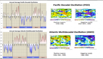
In the latter 1990s, the US fisheries department at UWA found that the Pacific Ocean cycles of warming and cooling affected where the fisheries migrated. In the 1990s, researchers found a similar cycle in the Atlantic Basin.
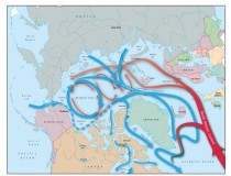
Both cycles have a major effect on global temperatures including arctic temperatures as the water (warm or cold) is carried by the currents under the arctic ice.

Enlarged
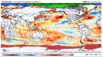
When the Pacific warms, warm water enters the arctic from the Bering Sea west of Alaska enhancing early season ice melt and delaying freeze and ice thickness. See the warmer average annual temperatures in the warm PDO, which favors more El Ninos (left) and the cold when PDO turns cold, which favors cooler La Ninas (right).

Enlarged
When the Atlantic warms, the warm water is carried by the currents under the ice (which is floating) and the arctic warms (left). That warm water has a significant effect on ice cover over the summer season. When the Atlantic cools, the melting decreases and the ice is thicker and more persistent. Cooling results (right).

Enlarged
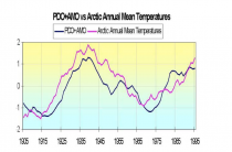
More ice means colder temperatures and see how the sum of the mean PDO and AMO tracks very well with arctic mean temperatures (from Polyokov, UAF).

Enlarged
This is supported by research. Francis et al. (GRL 2007) showed how the warming in the arctic and the melting ice was related to warm water (+3C) in the Barents Sea moving slowly into the Siberian arctic and melting the ice. She also noted the positive feedback of changed “=albedo” due to open water then further enhances the warming.
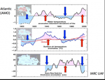
The International Arctic Research Center at the University of Alaska, Fairbanks showed how arctic temperatures have cycled with intrusions of Atlantic water - cold and warm.

Enlarged
Before the NSIDC was silenced in their objectivity, they wrote after 2007, “One prominent researcher, Igor Polyakov at the University of Fairbanks, Alaska, points out that pulses of unusually warm water have been entering the Arctic Ocean from the Atlantic, which several years later are seen in the ocean north of Siberia. These pulses of water are helping to heat the upper Arctic Ocean, contributing to summer ice melt and helping to reduce winter ice growth.”
Another scientist, Koji Shimada of the Japan Agency for Marine-Earth Science and Technology, reports evidence of changes in ocean circulation in the Pacific side of the Arctic Ocean. Through a complex interaction with declining sea ice, warm water entering the Arctic Ocean through Bering Strait in summer is being shunted from the Alaskan coast into the Arctic Ocean, where it fosters further ice loss.
Many questions still remain to be answered, but these changes in ocean circulation may be important keys for understanding the observed loss of Arctic sea ice.”

Enlarged
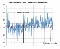
Note the North Polar atmosphere has warmed since the AMO warmed in 1995. Note also that it is now showing signs of cooling, which the late great hurricane guru Dr. Bill Gray thought might happen starting around 2020 (Atlantic temperatures affect the hurricane season too which got his attention). Note the decline after 2016 with some months 3C colder than the 2016 Super Nino peak.

Enlarged

Enlarged
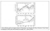
Dr. Willie Soon showed how the arctic temperature fit better with the solar than CO2.

Enlarged
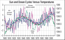
Solar appears to be the driver behind global temperatures and ocean cycles.

Enlarged
All CO2 does is increase world prosperity through plant fertilization - even the Sahara desert areal extent has declined 8%. The cold will return and the ice too. Humanity will be left poorer and greatly handicapped to deal with it.

Enlarged
Jun 04, 2021
CO2, Gas of Life; The EPA Disappears More Inconvenient Climate Data, Including 1930s U.S. Dust Bowl
Between June 10-13, Rasmussen surveyed 900 likely voters and, with a margin of error of 3%, found that only 29% agreed with Biden that climate change was the “greatest threat” facing the nation. Disagreeing with that assessment were 54% of Americans, while 17% were unsure either way.
Interestingly, only about 42% of Democrats agreed with Biden on climate change being the “greatest threat,” while roughly one-third of Democrats disagreed. Meanwhile, 76% of Republicans and 56% of independents also disagreed with the president’s ranking of climate change as the biggest threat facing the United States.
----------
CO2 not Pollution but the Gas of Life
By Joseph D’Aleo, CCM
I have always considered myself an environmentalist and conservationist. I worked on my doctorate in the 1970s with an atmospheric chemistry grant dealing with pollution.
In the post war boom, we had problems with air pollution from factories, coal plants, cars, inefficient home heating systems and incinerators in apartments.
We had air quality issues with pollutants like soot, SO2, ozone, hydrocarbons, NOx, and lead. Smog events in Donora PA 1948 saw 6,000 of the 14,000 population suffer damaged lungs, and the great London 1952 event which led to 6000 deaths helped drive global action.
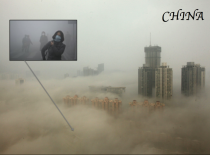
The problem was soot (particulates including carbon) and sulfur dioxide. When there is a fog with a low-level inversion preventing dispersion traps the particulates and the sulfur dioxide reacts with the water droplets to form sulfuric acid mist, which causes lung damage as well as damage to property. Today in a similar industrial boom with heavy coal use in places like China, they are experiencing similar issues.

My colleagues who became part of the EPA or their advisory boards helped them set standards that had to be met by industry and automakers. We were hugely successful.
The EPA reports:
“Between 1970 and 2019, the combined emissions of the six common pollutants (PM2.5 and PM10, SO2, NOx, VOCs, CO and Pb) dropped by 77 percent. For nearly 50 years, the Clean Air Act has brought Americans cleaner air and lower risks of adverse health effects.”
The EPA tracks the Air Quality Trends common pollutants nationally and reports that concentrations of air pollutants have dropped significantly since 1990:
* Carbon Monoxide (CO) 8-Hour, down 78%
* Lead (Pb) 3-Month Average, down 85% (from 2010)
* Nitrogen Dioxide (NO2) Annual, down 59%
* Nitrogen Dioxide (NO2) 1-Hour, down 51%
* Ozone (O3) 8-Hour, 25%
* Particulate Matter 10 microns (PM10) 24-Hour, down 46%
* Particulate Matter 2.5 microns (PM2.5) Annual, down 43% (from 2000)
* Particulate Matter 2.5 microns (PM2.5) 24-Hour, down 44% (from 2000)
* Sulfur Dioxide (SO2) 1-Hour, down 90%
You should note CO2 is not on the list of criteria pollutants.
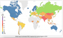
We have the cleanest air in my lifetime and well below the EPA health standards. In fact, the global trend of PM2.5 from NASA and the WHO shows the U.S. with reliance on clean natural gas has the lowest small particulate count (along with Scandinavia and Australia) in the world.

Enlarged

Enlarged
‘
The EPA notes “During this same period, the U.S. economy continued to grow, Americans drove more miles, and population and energy use increased.”
The IER agrees see “Breathe a Little Easier, Why America’s Air is Among the Cleanest in the World” here.
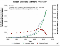
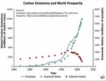
CO2 is not carbon. CO2 is not a pollutant. Shown here the other CO2 driven climate claims are either demonstrably false or can be entirely explained by natural factors. World prosperity and decreased poverty and death have resulted from the measurable benefits of the use of fossil fuels to mankind as shown below.

Enlarged
See much more here
---------------
NOAA, NASA, EPA associated with the CO2 and the supposed weather impacts have been altering data to support their theories and models. The media plays along as if it was actually even worse than forecast although not any of the 50 climate scares have come close to verifying.
See the temperature problems in this peer review paper. We listed uncertainties here. With Anthony Watts and many others, we did this thorough review over a decade ago. We have fact checked alarmist claims of CO2 increased extremes here.
Anthony exposed how the Biden Administration is reinventing data to align with the predictions made to get the desired policies though the congress.
EPA Disappears More Inconvenient Climate Data, Including the 1930s U.S. Dust Bowl
By Anthony Watts -May 26, 2021
The U.S. Environmental Protection Agency (EPA) brought back its Climate Change Indicator’s platform last week under the new Biden administration. In the new web presentation, EPA has simply disappeared data that was inconvenient to the narrative that humans are causing dangerous climate change. By not presenting the full historical data-set EPA previously showed, the agency is misleading the public by playing fast and loose with climate facts. Climate Realism first demonstrated this Biden administration data disappearing act in our report National Fire Center Disappears ‘Inconvenient’ U.S. Wildfire Data.
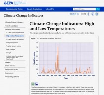
Now the EPA is doing the same thing - erasing important historic temperature data. EPA has deleted its earlier web page Climate Change Indicators: High and Low Temperature and replaced it with a new one. Previously, they showed the U.S. Heat Wave Index from 1895 to 2015 that clearly established the unique drought and heat period of the 1930s.
Fortunately, the Internet never forgets, and as recently as May 1st, 2021, the original EPA page was archived on the Internet, as shown as Figure 1.

Figure 1. Previous EPA graph before the Biden administration change with data from 1895 to 2015. Enlarged
Note in Figure 1 that there is a very prominent spike of temperatures during the 1930s during the so-called “dust bowl” period in United States history. According to the National Weather Service,
“The “Dust Bowl” years of 1930-36 brought some of the hottest summers on record to the United States, especially across the Plains, Upper Midwest and Great Lake States. For the Upper Mississippi River Valley, the first few weeks of July 1936 provided the hottest temperatures of that period, including many all-time record highs.
The string of hot, dry days was also deadly. Nationally, around 5000 deaths were associated with the heat wave.”
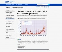
That long-standing heat wave index chart has now been replaced by a new chart which simply “disappears” any notion of the great heat wave period of the 1930s. The EPA erased the previous data, substituting data more favorable to an alarmist narrative, as Figure 2 below shows.

Figure 2. New EPA chart after the Biden administration change with data from 1910 to 2015. Enlarged
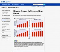
The EPA has also added another new page Climate Change Indicators: Heat Waves that does not even contain the 1930s “dust bowl.” Instead, EPA’s report starts in the 1960s, a low-point for heatwaves in the 20th century, as seen in Figure 3. By starting the new graphs in the 1960s, rather than using all the available data back to 1895, EPA ensures a positive and uninterrupted upward trend in heat waves.

Figure 3, EPA’s new page showing data only from 1960, totally eliminating the 1930s dust bowl period Enlarged
On a positive note, the EPA has retained the original page, Climate Change Indicators: Drought seen in Figure 4, which remains the same and shows no worsening drought trend in the United States. Given the recent changes EPA’s other charts, this non-alarming drought chart is probably short-lived on EPA’s webpage.

Figure 4. EPA page Climate Change Indicators: Drought Enlarged
At the outset of its Climate Change Indicator’s page EPA makes some demonstrably false statements
“The Earths climate is changing. Temperatures are rising, snow and rainfall patterns are shifting, and more extreme climate events - like heavy rainstorms and record high temperatures - are already happening. Many of these observed changes are linked to the rising levels of carbon dioxide and other greenhouse gases in our atmosphere, caused by human activities.”
The decision to erase weather and climate data history makes it clear EPA’s opening argument is weak, based on cherry picking data that only agrees with their premise.
It appears that we have entered the Soviet style era of “disappearing” charts and data. If the EPA’s new Climate Change Indicators Series is any indication of the future government climate reports, it appears we are now entering the era of the “Biden inconvenient climate data purge.”
Anthony Watts is a senior fellow for environment and climate at The Heartland Institute. Watts has been in the weather business both in front of, and behind the camera as an on-air television meteorologist since 1978, and currently does daily radio forecasts. He has created weather graphics presentation systems for television, specialized weather instrumentation, as well as co-authored peer-reviewed papers on climate issues. He operates the most viewed website in the world on climate, the award-winning website wattsupwiththat.com.
|
